Choose the sentence that needs a voice
A greeting or short quotation is a useful place for handwriting. Let ‘Thank you for today’ carry the personality and use a simple supporting face for dates and instructions. You can preserve the warmth without making every piece of information look handwritten.
Test beyond an attractive greeting
Add numerals, punctuation, and easily confused letters to the specimen. For Korean text, include words with final consonants; for Japanese, include kanji and voiced marks. Variation in size and slant can be appealing, but information still needs to be distinguishable at the final size.
Cut words before shrinking the type
When a card is crowded, remove repeated ideas or split the message into two natural parts. Keep the background around the lettering simple. Then read the date, location, and contact details on their own. Use a creator’s official account for a font’s backstory rather than inventing a personal history from its appearance.
Practical troubleshooting
The invitation date is read as another number
Original hypothetical editing exercises by MongleFonts, shown in the site’s default font. These are not client projects or measured outcomes.
Come along! November 17, 1 pm, Cloud Square
Come along! November 17, 1 pm Cloud Square
A warm greeting and an accurate schedule have different roles. In this fictional invitation, keep handwriting for the greeting and compare a separate information face. Not every word needs decoration.
Try it step by step
- Cover the greeting and read only the date, time, and venue, including potentially confusing numerals.
- If figures are ambiguous, change only the information face and keep the greeting fixed.
- Check punctuation and dense letter details at the final card size.
- Include the schedule in the accompanying message and compare it with the image.
| What you see | What to change first |
|---|---|
| The date needs a second reading | Give essential information a clearer typeface. |
| Details merge at small sizes | Check size and weight; restrict handwriting to short greetings if needed. |
| Decoration hides the venue | Move it away and add space around essential information. |
Case updated · MongleFonts
Compare with this copy
Original layout practice copy by MongleFonts, shown in the site’s default typeface. This is not a specimen of a catalog font.
Thank you for today.
Better when we’re together
19 September · 3 pm
Try this comparison sequence
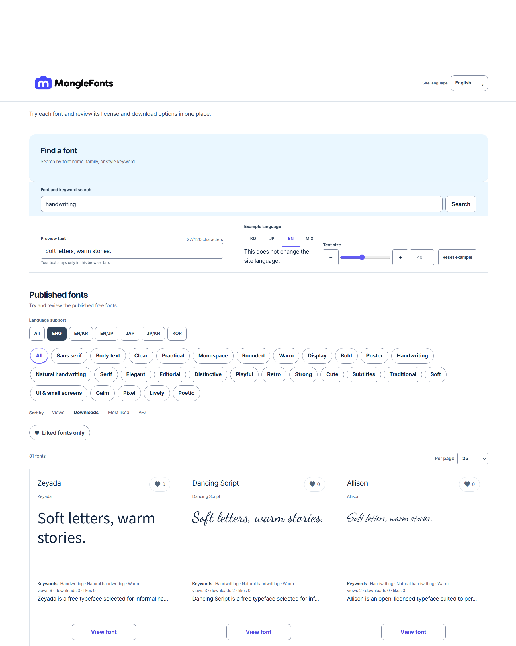
- Search for “handwriting” to narrow the candidates.
- Replace the preview with real copy from your handwritten design.
- Compare a few faces at the same size, then adjust weight and spacing in the final medium.
- Check language coverage, the official source, and license terms for your intended use on the detail page.
Before you finish
- Are the greeting and essential instructions distinct?
- Can you distinguish numerals and punctuation at the final size?
- Have you read the date, location, and contact details separately?
Continue with a catalog font
- 고운돋움 · Gowun Dodum
Consider Gowun Dodum when exploring a Korean sans serif with a handwritten touch. Assess the greeting’s tone separately from the accuracy of hours and prices.