Give the poster one lead
When the event name, date, and location have equal emphasis, the reader has to decide where to start. Give the name a distinctive face and use a quieter face for the practical details. Shrink the composition to a thumbnail and check whether the main message survives.
Keep prices and units easy to scan
On a product page, test the price, quantity, and units together: ‘12.90 / 250mL / 2 packs.’ Check whether a currency symbol or unit switches to another font. The product name can carry personality while small conditions and delivery information use a clearer supporting face.
Judge the final background and size
Thin strokes that look clear on white may disappear over a photograph. Move the text into a quieter area or compare a plain background behind it. Review a product image at phone width and a printed poster at physical size. Put essential product conditions in page text as well as in images.
Practical troubleshooting
The event name is visible, but the date is not
Original hypothetical editing exercises by MongleFonts, shown in the site’s default font. These are not client projects or measured outcomes.
Cloud Market · October 3 · 2 pm · Cloud Square · Free entry
Cloud Market October 3, 2 pm · Cloud Square Free entry
This fictional event separates the title, schedule, and supporting information. Giving everything equal emphasis makes the reading order harder to choose. Assign roles before changing decorative fonts.
Try it step by step
- List the event, date, time, and location as text and check for omissions.
- Make the event name primary and group the schedule with the location.
- Reduce to the intended phone width and read only the date and venue first.
- Compare the final image with the accompanying post and provide the schedule as text too.
| What you see | What to change first |
|---|---|
| The date competes with the title | Group the schedule and reserve strongest emphasis for the title. |
| Numbers fill in at small sizes | Revisit the information text’s weight and size. |
| Every line starts somewhere different | Align the schedule and venue first. |
Case updated · MongleFonts
Compare with this copy
Original layout practice copy by MongleFonts, shown in the site’s default typeface. This is not a specimen of a catalog font.
The Saturday mini market
19 September · 2 pm
The neighborhood bookshop garden
Try this comparison sequence
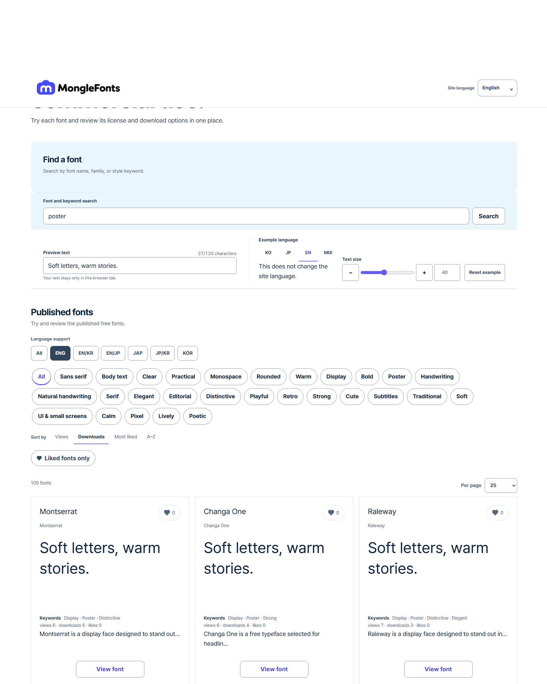
- Search for “poster” to narrow the candidates.
- Replace the preview with real copy from your poster.
- Compare a few faces at the same size, then adjust weight and spacing in the final medium.
- Check language coverage, the official source, and license terms for your intended use on the detail page.
Before you finish
- Is the event name, date, and location hierarchy clear?
- Are prices and units readable on a small screen?
- Have you checked the real photograph and final output size?