Match apparent size, not just the number
Hangul, Japanese kana, and Latin lowercase letters occupy different amounts of visible space. The same font-size value can make the Latin text look smaller. Set the actual copy together and compare height and stroke density. Change size and weight separately so you can see what helped.
Test where the scripts meet
A line such as ‘Seoul 서울 / 東京 10:30’ exposes changes in punctuation, spaces, and numeral position. Check mixed text as well as separate translations. Add real addresses, names, and place names: a short language specimen cannot confirm that every required character exists.
Declare the language and supply the glyphs
W3C explains that language information helps processes such as speech output and font selection. On the web, mark Japanese passages as ja and Korean passages as ko. A lang attribute does not add missing characters to a font, however. Correct language markup and a font with the required glyphs work together.
Practical troubleshooting
One character in a Japanese name looks different
Original hypothetical editing exercises by MongleFonts, shown in the site’s default font. These are not client projects or measured outcomes.
Check only the three characters 日本語
Check real names, places, prices, and punctuation
A short language sample cannot prove full coverage. A fallback character can differ in height and weight. Check character availability separately from language-specific forms.
Try it step by step
- Prepare complete translations including names, places, prices, and punctuation.
- Inspect unusual characters and compare the browser’s rendered-font information with official coverage information.
- Choose a family containing the required characters. Correct language markup cannot create missing glyphs.
- Recheck the mixed-language line for baselines, parentheses, and line breaks.
| What you see | What to change first |
|---|---|
| One character has a different weight | Check whether a fallback renders it. |
| The glyph exists but has a different regional form | Check the language-specific family and document language. |
| The translation overflows | Allow space for the real copy and revisit wrapping. |
Case updated · MongleFonts
Compare with this copy
Original layout practice copy by MongleFonts, shown in the site’s default typeface. This is not a specimen of a catalog font.
Seoul 서울 / 東京
Today’s show · 오늘의 전시 · 今日の展示
10:30–18:00
Try this comparison sequence
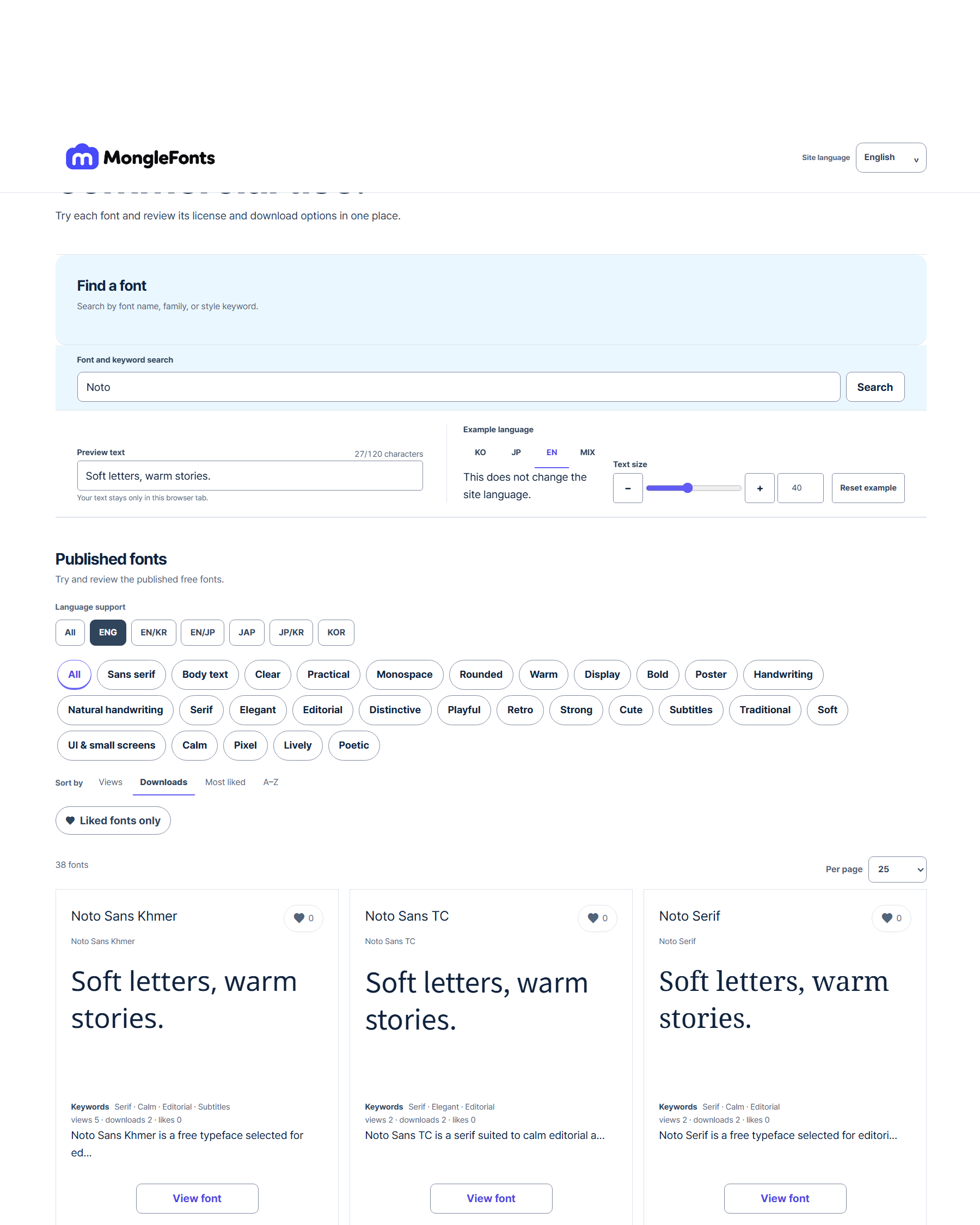
- Search for “Noto” to narrow the candidates.
- Replace the preview with real copy from your multilingual design.
- Compare a few faces at the same size, then adjust weight and spacing in the final medium.
- Check language coverage, the official source, and license terms for your intended use on the detail page.
Before you finish
- Have you tested the real translations, names, and places?
- Do numerals and punctuation fit comfortably?
- Have you checked coverage and line breaks for each language?
Continue with a catalog font
- Pretendard
For Pretendard interfaces, check the loaded weights and language family, then compare a short action, a price, and a long message together.
- D2Coding
Compare D2Coding with real code containing figures, punctuation, and Korean comments. Its usefulness for code should be assessed separately from ordinary prose.