Choose on moving footage
A caption needs to work while the scene is moving. Take a short sequence with a bright window, a dark interior, and a cut, then place the same sentence over it. Play it on a phone. If it is hard to finish reading, check the typeface, amount of text, and time on screen separately.
Break lines at a natural phrase
Keep words that belong together on the same line instead of forcing two lines to be equal in length. The useful line length depends on language, duration, and aspect ratio. A delivery specification for one streaming service is not a universal rule for every YouTube video.
Check outlines and delivery format
A heavy outline can close the spaces inside letters. Compare a different font weight or a simple caption background before increasing the outline again. Burned-in captions and caption files are different delivery methods. YouTube handles styling according to the supported file format, so do not assume the editor’s appearance will carry over.
Practical troubleshooting
Readable when paused, too fast during playback
Original hypothetical editing exercises by MongleFonts, shown in the site’s default font. These are not client projects or measured outcomes.
Now you should add all the prepared ingredients and then mix them thoroughly.
Add all the ingredients. Mix thoroughly.
This fictional cooking instruction keeps two actions and removes verbal padding. It is an editing exercise, not permission to omit meaningful dialogue or sound information from accessibility captions.
Try it step by step
- Play a short section at normal speed and mark where reading falls behind.
- If only bright scenes cause trouble, adjust separation from the background. If every scene is too fast, inspect duration and reading load.
- Keep the font fixed while changing line breaks; then compare weights with the same sentence.
- Check on a phone without sound, then restore sound to check synchronization.
| What you see | What to change first |
|---|---|
| Text disappears on bright scenes | Check an outline or background box. |
| The ending is always missed | Reconsider display time and reading load. |
| Text is clear but hides the action | Move it away from faces, demonstrations, and player controls. |
Case updated · MongleFonts
Compare with this copy
Original layout practice copy by MongleFonts, shown in the site’s default typeface. This is not a specimen of a catalog font.
After getting home,
I made a cup of warm tea.
Try this comparison sequence
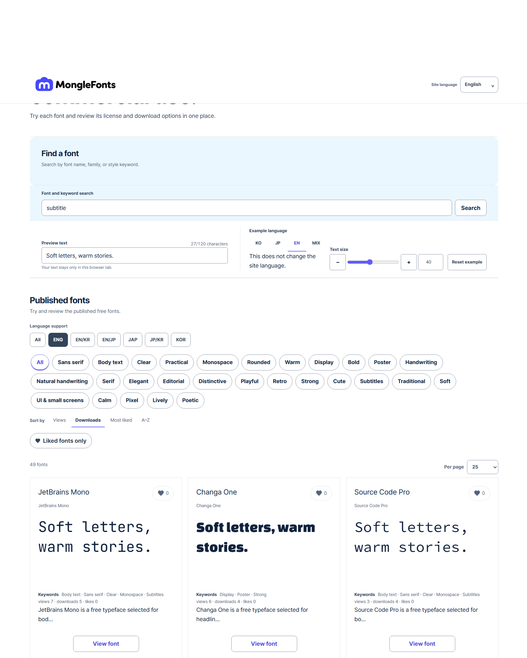
- Search for “subtitle” to narrow the candidates.
- Replace the preview with real copy from your subtitle.
- Compare a few faces at the same size, then adjust weight and spacing in the final medium.
- Check language coverage, the official source, and license terms for your intended use on the detail page.
Before you finish
- Can you finish reading at normal playback speed?
- Do letter interiors stay open on bright and busy scenes?
- Are faces, essential details, and player controls unobstructed?