Read three paragraphs, not one line
A short specimen cannot show how a typeface feels over a longer passage. Set three paragraphs from the real manuscript, including a subheading, a quotation, and numerals. Notice whether your eye finds the next line easily and whether fine strokes remain visible at the intended size.
Adjust measure before chasing spacing
Try the same passage at different column widths, then adjust line spacing. Do not transfer Latin character-count advice directly to Korean or Japanese text. Adobe distinguishes tracking across a selection from kerning between a pair of characters. A gap in a single heading should not require changing the whole paragraph.
Include the small supporting text
Footnotes, page numbers, and photo captions belong in the trial layout. Check numerals and parentheses at their smaller sizes and make sure these elements sit comfortably beside the body. For print, inspect a physical-size proof: enlarging the screen can hide weak fine strokes.
Practical troubleshooting
Losing the start of the next line
Original hypothetical editing exercises by MongleFonts, shown in the site’s default font. These are not client projects or measured outcomes.
Change width, size, and leading together
Compare width → leading → footnotes
Long-form reading depends on continuity, not the appearance of a single line. Changing several values at once hides the cause. Make a comparison record with three paragraphs of the same manuscript.
Try it step by step
- Use real copy containing a heading, three paragraphs, figures, parentheses, and a footnote.
- Fix the family, size, and weight; compare two text widths.
- Keep the preferred width and adjust leading gradually, watching for both crowded and disconnected lines.
- Print at actual size for print work; otherwise check the intended reading screen, including footnotes.
| What you see | What to change first |
|---|---|
| Reading the same line twice | Compare width, then leading. |
| Body text is fine but notes are faint | Adjust the notes independently. |
| Justified words have uneven gaps | Inspect word spacing and line breaks. |
Case updated · MongleFonts
Compare with this copy
Original layout practice copy by MongleFonts, shown in the site’s default typeface. This is not a specimen of a catalog font.
The pace of a page
Even a short sentence needs room to breathe. Paragraph space shapes the reading rhythm alongside the spaces between letters.
01 · Small observations
Try this comparison sequence
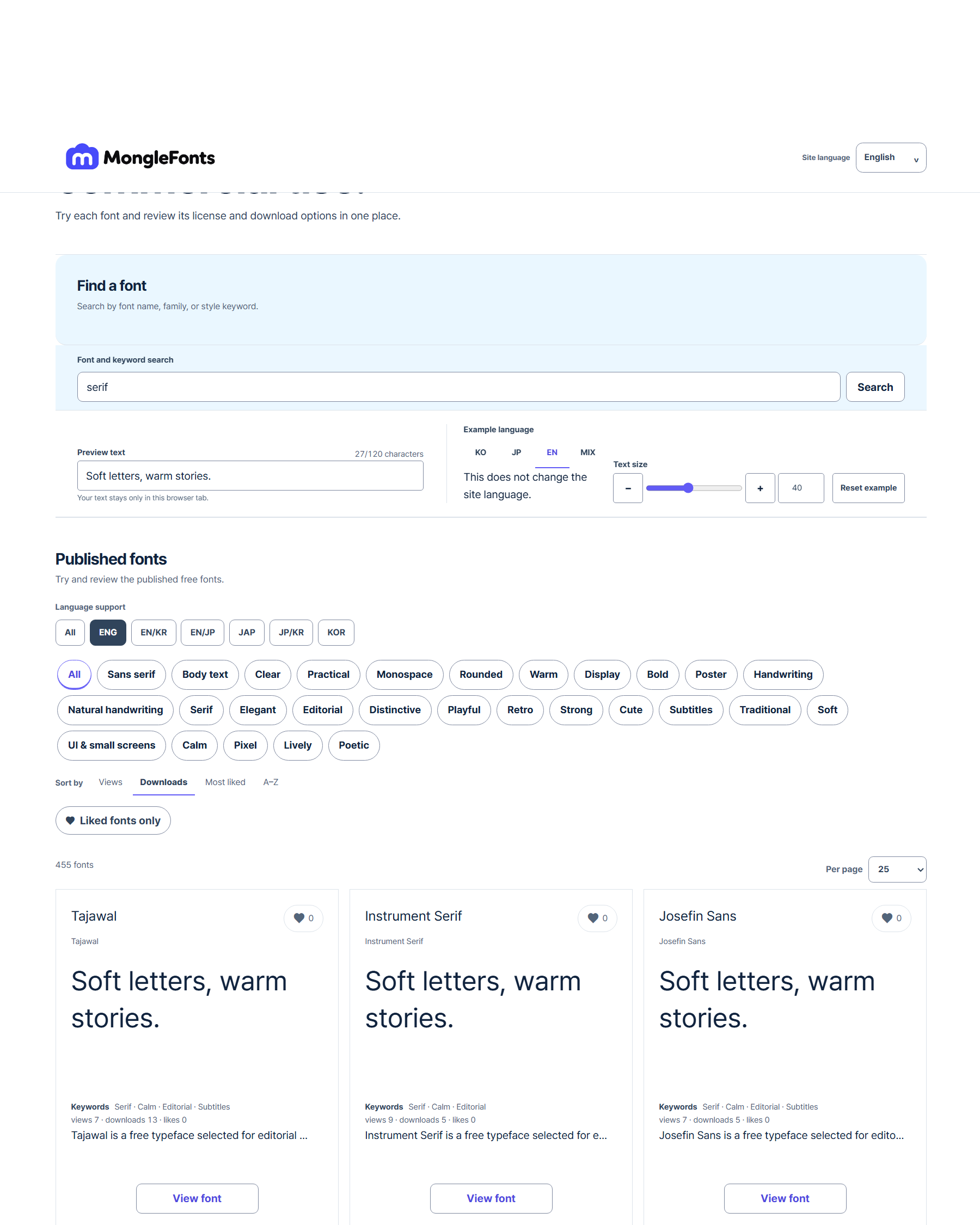
- Search for “serif” to narrow the candidates.
- Replace the preview with real copy from your editorial layout.
- Compare a few faces at the same size, then adjust weight and spacing in the final medium.
- Check language coverage, the official source, and license terms for your intended use on the detail page.
Before you finish
- Have you read three paragraphs from the manuscript?
- Can your eye find the next line easily?
- Are footnotes, page numbers, and parentheses distinguishable?
Continue with a catalog font
- D2Coding
Compare D2Coding with real code containing figures, punctuation, and Korean comments. Its usefulness for code should be assessed separately from ordinary prose.
- 고운돋움 · Gowun Dodum
Consider Gowun Dodum when exploring a Korean sans serif with a handwritten touch. Assess the greeting’s tone separately from the accuracy of hours and prices.