Start with the Save button
A UI typeface has to work in small buttons and error messages, as well as large headings. Test ‘Save,’ ‘Try again,’ and ‘Total 11,000’ at their real sizes. Compare the numeral 1, uppercase I, and lowercase l. The useful question is whether people can read the next action clearly.
Allow room for longer labels
A compact label may fit while a translation or a full error message wraps. Leave room for content to grow instead of fixing everything to a single line. Check narrow layouts and browser enlargement. Shrinking the font to fit can undermine the reader’s reason for enlarging the page.
Inspect loading and missing characters
web.dev describes how font loading and fallback choices can affect rendering and layout movement. On a slow connection, watch paragraphs and buttons as the font changes. If only certain characters look different, another font may be supplying them. Test the scripts, prices, and punctuation that the interface actually uses.
Practical troubleshooting
Save fits, but the error message clips
Original hypothetical editing exercises by MongleFonts, shown in the site’s default font. These are not client projects or measured outcomes.
Save
Could not save. Check your connection and try again.
One short button does not cover long translations or error states. This exercise expands the copy, not a font performance benchmark. Check whether the container can grow before making the text smaller.
Try it step by step
- Prepare a normal state, a long action label, and a two-sentence error message.
- Check the full message and next action at a narrow width and with zoom.
- Inspect fixed heights, overflow, and wrapping rather than assuming a font change will solve clipping.
- Compare before and after font loading, then confirm with an actual supported weight.
| What you see | What to change first |
|---|---|
| The last error line disappears | Inspect container height and overflow. |
| Buttons move after the font loads | Check fallback width differences and available space. |
| One character looks different | Check which font actually renders that character. |
Case updated · MongleFonts
Compare with this copy
Original layout practice copy by MongleFonts, shown in the site’s default typeface. This is not a specimen of a catalog font.
Order total 11,000
Please check your delivery address.
Save and continue
Try this comparison sequence
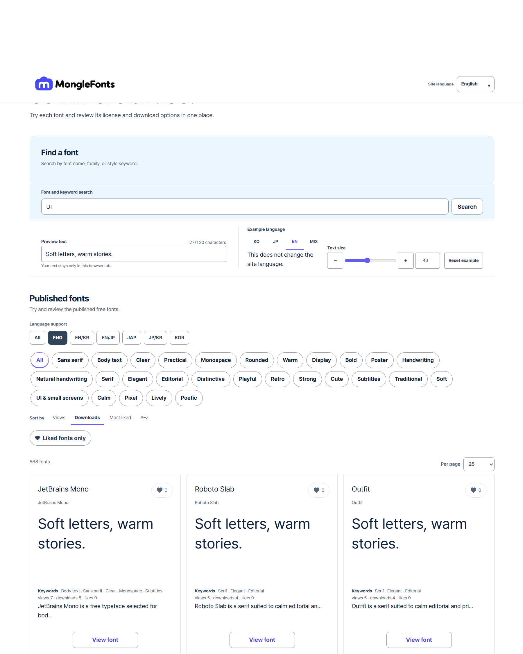
- Search for “UI” to narrow the candidates.
- Replace the preview with real copy from your interface.
- Compare a few faces at the same size, then adjust weight and spacing in the final medium.
- Check language coverage, the official source, and license terms for your intended use on the detail page.
Before you finish
- Do long translations and error messages fit without clipping?
- Does the action remain readable when enlarged?
- Have you checked font loading and missing characters?
Continue with a catalog font
- Pretendard
For Pretendard interfaces, check the loaded weights and language family, then compare a short action, a price, and a long message together.
- D2Coding
Compare D2Coding with real code containing figures, punctuation, and Korean comments. Its usefulness for code should be assessed separately from ordinary prose.